Promo Stories
Promo Stories
Promo Stories
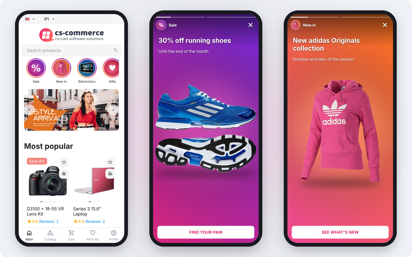
The add-on brings social-network-style stories to the storefront: a row of round covers with promotions, new arrivals and store news. Tapping a circle opens a viewer with slides — a vertical picture, a heading, a text and a button leading to a product, a category, a page or any address.
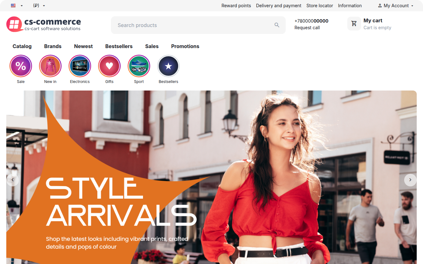
On the storefront. Stories are shown by the Promo stories block, which goes anywhere in a layout: on the home page under the menu, in the catalog, on the product page. Unviewed stories are marked with a colored ring, viewed ones turn grey and move to the end of the row. On a phone the viewer opens full screen and responds to the familiar gestures; on a computer it is a vertical card in the middle of the screen with arrow buttons and keyboard control.
In the admin panel. Every story has a name, a cover, its own ring color, a display period and the customer groups it is visible to: a promotion appears and disappears on the right dates by itself. Slides are built in a separate dialog, and their order is changed right in the list. For a quick start there are one-click demo stories and cloning of a ready story.
Statistics. The add-on counts story opens, completions and button clicks, and for every slide — views, clicks and CTR.
Stories are managed on the Marketing → Promo Stories page; the appearance and playback settings are there too, under General settings in the side menu.
The add-on works with CS-Cart and Multi-Vendor starting from version 4.3.1 and supports the CS-Cart, CS-Cart Ultimate, Multi-Vendor, Multi-Vendor Plus and Multi-Vendor Ultimate editions.
The storefront templates are shipped for the Responsive theme and themes based on it. The script and styles are connected through the index:scripts and index:styles hooks, and the stories themselves are rendered by the Promo stories layout block (template addons/csc_stories/blocks/stories.tpl). Nothing has to be added to the theme templates by hand.
The story viewer works in modern browsers on phones, tablets and computers: gestures are handled through pointer events, the same way for touch and mouse. The viewed mark is kept in the visitor's browser localStorage; if the storage is unavailable (for example, in some private modes), stories are simply not marked as viewed, and everything else keeps working.
In CS-Cart Ultimate stories and settings are kept separately for each storefront. In Multi-Vendor stories are shared by the whole marketplace and managed by the administrator; the section is not shown in the vendor panel. In Multi-Vendor Ultimate with several storefronts the add-on settings are set per storefront.
Story and slide texts are translated into every store language. When a new language is added, the texts are copied into it from the source language; when a language is deleted, its texts are deleted too.
If the add-on conflicts with your theme or another solution, please contact our support center.
After success payment, your order will be automatically marked as Paid within a few minutes. Once order changed to Paid status - add-on License activation passed success and you will received an e-mail with confirmation the receipt of payment and a second e-mail with a download add-on link. You can also download the add-on in our License Management section of our website. To install the add-on on your website, please follow these steps:
- Download the latest version of the add-on on our website in the "License Management" section or via the link sent by e-mail.
- Go to Add-ons → Manage Add-ons and in the gear button, select Manual Installation.
- Select the downloaded file and complete the installation of the add-on.
Add-on installation is completed. To go to the add-on settings page, select the installed add-on in the top menu Add-ons → CS-Commerce add-on
The add-on is managed on the Marketing → Promo Stories page. The same page opens from Add-ons → CS-Commerce Addons → Promo Stories, and when you open the add-on settings from the Add-ons → Manage add-ons list, the system redirects you to the add-on settings page automatically.
The side menu of the page has two items:
- Stories — the list of stories, creating them, their slides and statistics; see Stories and slides and Statistics;
- General settings — the look of the circles and buttons, playback, marking viewed stories and collecting statistics; see General settings.
For stories to appear on the storefront, the Promo stories block has to be placed in a layout — see Storefront block. The steps for the first launch:
- create a story and add slides to it (or click Add demo stories to see the add-on in action);
- add the Promo stories block to the right place of the layout;
- adjust the colors and the viewer behavior in General settings if needed.
Settings per storefront
In CS-Cart Ultimate with several storefronts both the stories and the add-on settings are kept separately for each storefront; the storefront is selected with the switch in the page header. Until a storefront is selected, the settings fields cannot be changed and the standard lock icon appears next to each of them — in the unlocked state the value is written to all storefronts at once. When a storefront is deleted, its stories are deleted too.
In Multi-Vendor stories are shared by the whole marketplace; vendors have no stories or settings of their own. In Multi-Vendor Ultimate the add-on settings are set per storefront, the same way as in CS-Cart Ultimate.
Access rights
The add-on adds its own privilege group — Manage Promo Stories. It contains two privileges: View promo stories and Manage promo stories. By default they are not granted to any user group, so an administrator with limited rights will not see the section until the privileges are granted to their group. Viewing gives access to the lists, slides and statistics; managing allows any change, including resetting statistics and the add-on settings.
The settings open with the General settings item in the side menu of the Marketing → Promo Stories page and are split into four groups.
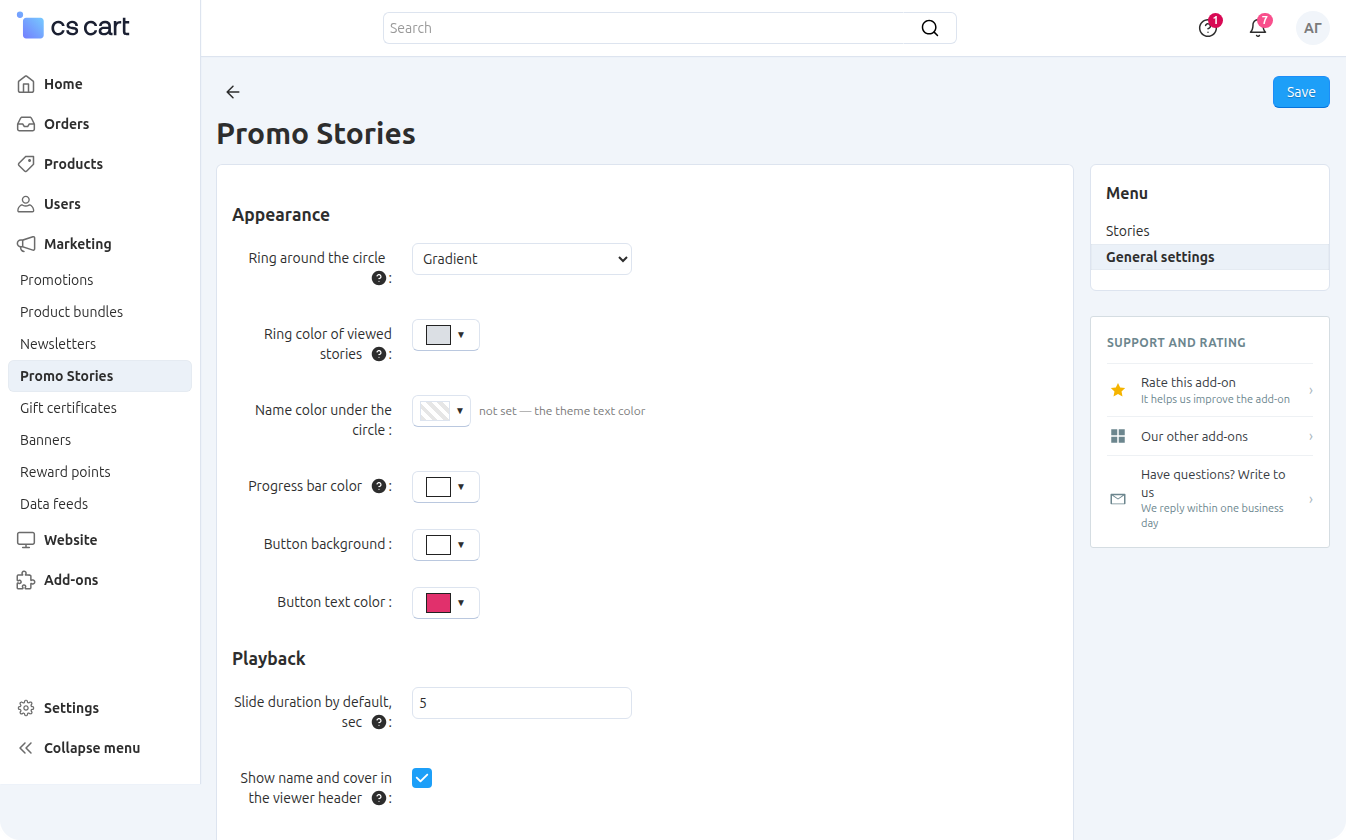
Appearance
Ring around the circle — the ring marks unviewed stories, like in social networks: Gradient (default), Solid color or No ring.
Ring color — #e1306c by default; shown and used with the Solid color ring style. A single story can have its own ring color, which takes priority over this setting.
Ring color of viewed stories — #DBDFE4 by default; applied after the visitor has watched the story.
Name color under the circle — not set by default, the theme text color is used.
Progress bar color — the thin bars at the top of the viewer, white (#ffffff) by default.
Button background and Button text color — the button on slides, white with #e1306c text by default. Both colors can be overridden for a single slide.
Playback
Slide duration by default, sec — 5 by default; used for slides without a duration of their own.
Show name and cover in the viewer header — enabled by default: a small avatar and the story name are shown above the slide.
Go to the next story automatically — enabled by default: after the last slide the next story of the row starts. When disabled, the viewer closes after the last slide. Paging forward manually from the last slide still moves on to the next story.
Loop stories — disabled by default. When enabled, the first story starts again after the last one, and the arrow buttons on a computer never stop at the ends of the row.
Viewer on desktop — Vertical card in the center of the screen (default) or Full screen. On mobile devices the viewer always opens full screen.
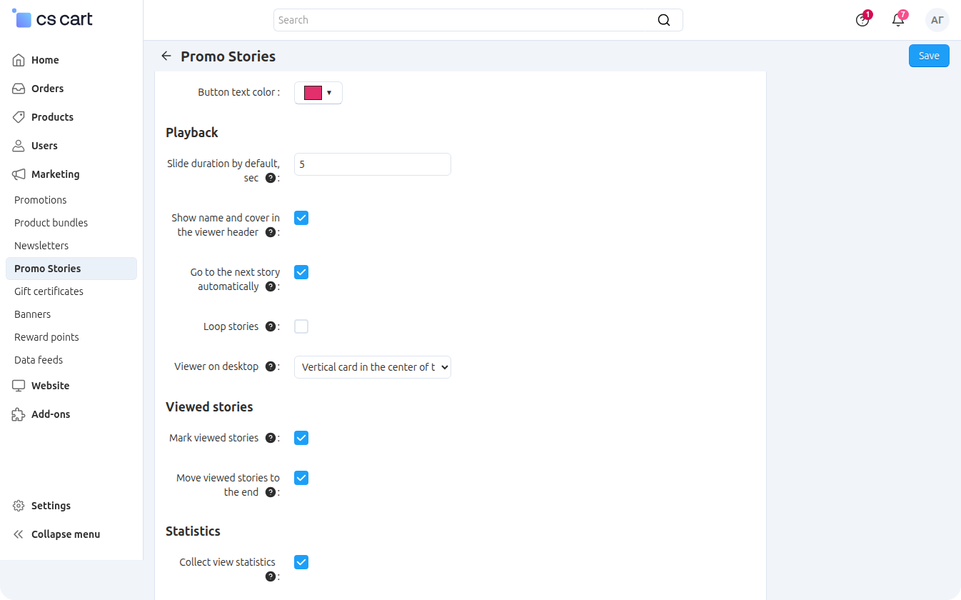
Viewed stories
Mark viewed stories — enabled by default. A story counts as viewed once the visitor has reached its last slide; the ring of such a story turns grey. The mark is stored in the visitor's browser and resets on any change of the story or its slides: an updated story looks new to everyone again.
Move viewed stories to the end — enabled by default, shown when marking is enabled. Unviewed stories always come first in the row.
Statistics
Collect view statistics — enabled by default. Opens, slide views, button clicks and completions are counted and shown on the page of each story (see Statistics). When disabled, the storefront stops sending events, and the figures collected so far are kept.
The list of stories opens with the Stories item in the side menu of the Marketing → Promo Stories page. Every story shows its cover, name, number of slides, display period, opens and clicks, position and status. The status is switched right in the list, and the checked stories can be enabled, disabled or deleted at once.
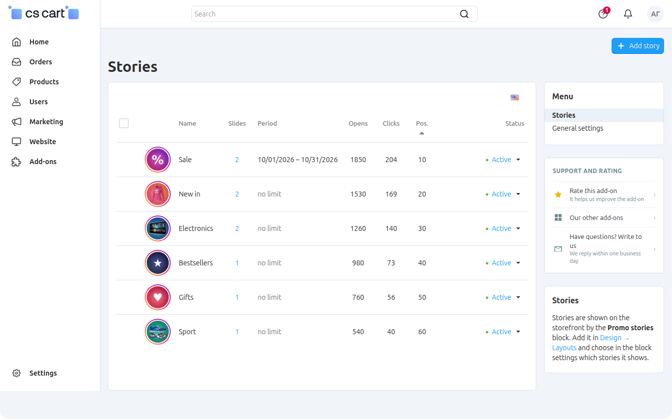
Stories
A story is one circle in the storefront row and the set of slides behind it. The Add story button opens a form with the fields:
- Name — shown under the circle and in the viewer header;
- Position — the order of stories in the row, ascending;
- Status — enabled or disabled;
- Cover — the circle image. A square picture works best: it is cropped to a circle;
- Ring color — a ring color of this story. An empty field means the ring style from the add-on settings;
- Display period — the start and end dates. The story is shown from the beginning of the first day to the end of the last one; both dates empty means no time limit. In the list such stories are marked as scheduled or expired;
- User groups — who sees the story: everyone, guests, registered customers or specific customer groups.
After the first save the story gets the Slides and Statistics tabs.
A story without enabled slides is not shown on the storefront, even if the story itself is enabled.
Slides
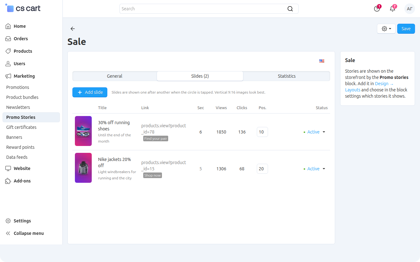
The Slides tab lists the story's slides with their position, status, duration, views and clicks. The order is changed with the position field right in the list and saved with the common Save button. The Add slide button and the slide title link open the edit dialog:
- Image — a vertical 9:16 picture (e.g. 1080×1920). A slide with no image shows the text on the background color;
- Title and Text — plain text without HTML markup;
- Text position — Top, Center or Bottom;
- Background color — when set, the picture is shown entirely and the free space around it is filled with this color; when not set, the picture is cropped to fill the screen;
- Text color — the color of the heading and text, white by default;
- Link — where the button leads: a full URL or a store address like
products.view?product_id=1,categories.view?category_id=2,pages.view?page_id=3. Without a link the slide has no button; - Open in new window;
- Button text — when empty, the button shows the slide title;
- Button background and Button text color — the colors of this slide's button; empty means the add-on settings;
- Duration, sec — how many seconds the slide is shown before switching, from 1 to 60; empty means the value from the add-on settings;
- the slide Position and Status.
A slide with no image, no title and no text is skipped on the storefront.
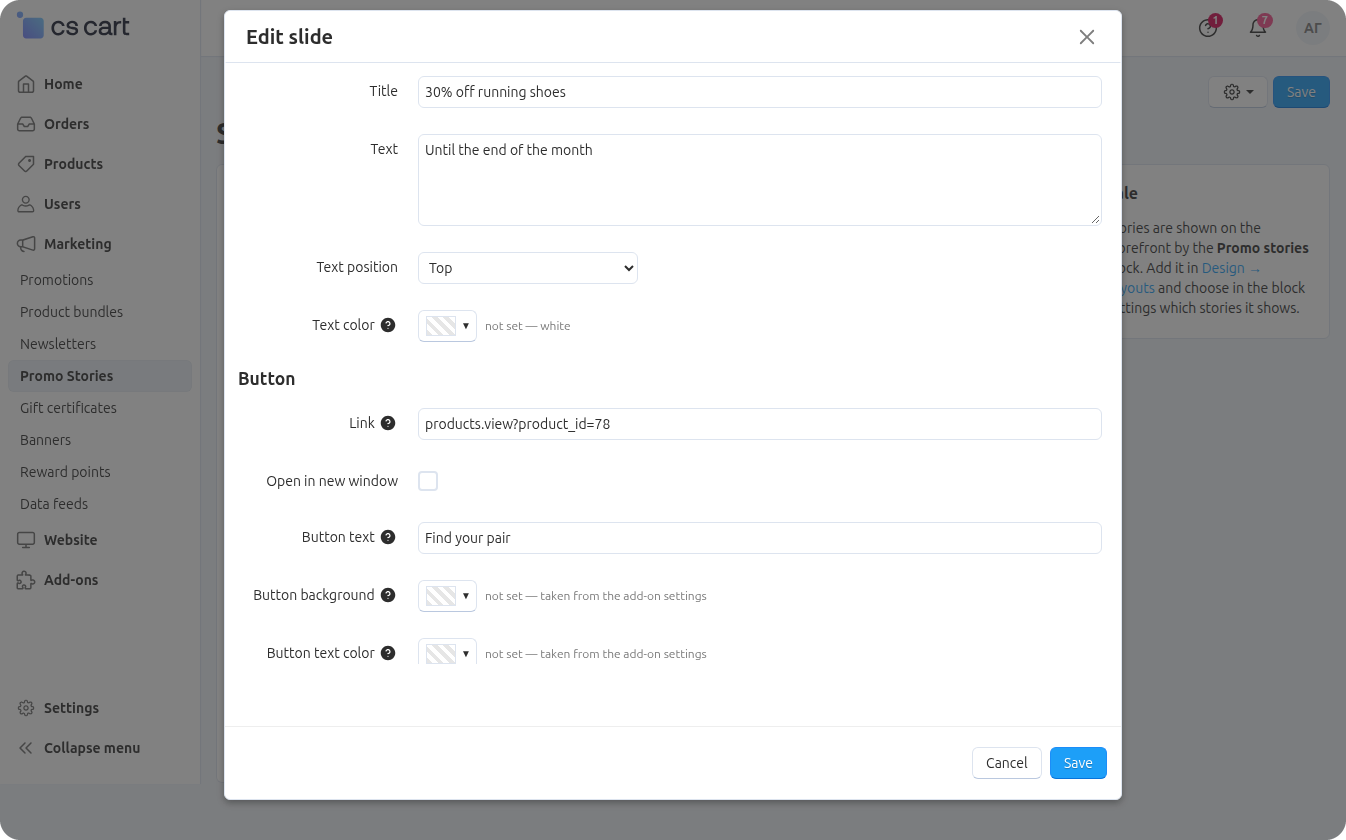
The story name and the slide and button texts are translated into every store language: the editing language is chosen with the flag in the top right corner of the form, as elsewhere in the CS-Cart admin panel.
Demo stories
The Add demo stories item in the gear menu of the list (and, for an empty list, the button in the middle of the page) creates four ready stories — Sale, New in, Bestsellers and Gifts — with two slides each, pictures and buttons leading to promotions and product selections. The Russian store language gets Russian texts, every other language gets English ones.
Demo stories are created enabled and appear on the storefront at once if the Promo stories block is already placed there. Clicking again adds four more stories instead of replacing the previous ones.Cloning
The Clone item in the gear menu of a story (in the list and on the story page) creates a copy with all slides, pictures and texts in every language. "(copy)" is added to the name of the copy, and the statistics are not copied. The copy is created disabled so that it does not appear on the storefront before it is checked: replace the pictures and texts and switch it on.
On the storefront the stories are shown by the Promo stories block. Add it to the right place of the layout in Design → Layouts (in CS-Cart 4.18 and later, Website → Themes → Layouts): on the home page under the menu, in the catalog, on the product page. There can be several blocks, each with its own set of stories.
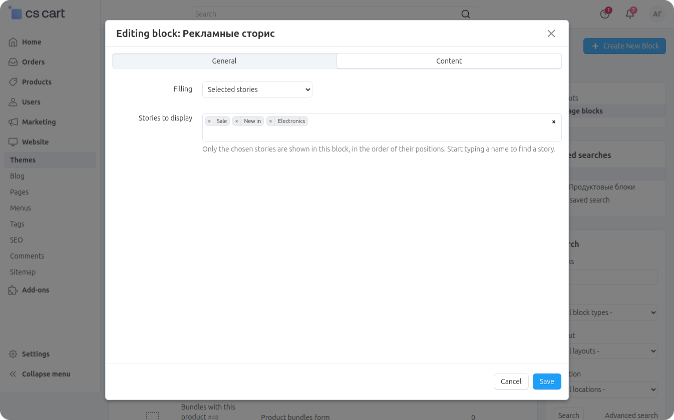
On the Content tab of the block the Filling field defines which stories are shown:
- All active stories — all enabled stories whose display period is running now and which are visible to the visitor's group. The Maximum number of stories (empty = all) field limits their number;
- Selected stories — only the stories from the Stories to display field; start typing a name to find a story. They are shown in the order of their positions, and disabled, not yet started and expired ones are skipped.
The block template has three settings of its own:
- Circle size, px — 72 by default, from 40 to 160;
- Show names under circles — enabled by default;
- Alignment — Left (default) or Center.
Showing the block on phones, tablets and computers is controlled by the standard CS-Cart block settings. If the circles do not fit the width, the row scrolls sideways.
While the page is loading, placeholders of the same size and number stand in for the circles, so the layout does not jump and the circles appear in the right order at once — unviewed ones first.
The block is cached by the standard CS-Cart block cache, which is reset when stories and slides change. While any enabled story has a display period, the block is built without the cache so that stories appear and disappear exactly on the set dates.
Tapping a circle opens the viewer. On a phone it takes the whole screen; on a computer it is a vertical card in the middle or the whole screen, depending on the Viewer on desktop setting. At the top there are progress bars, one per slide, and, if enabled, the story avatar and name.
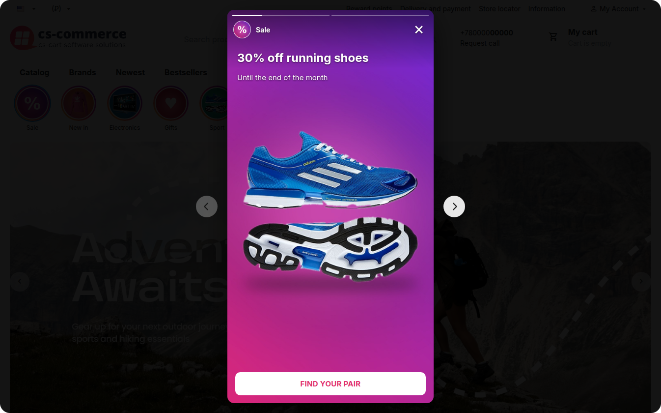
Slides switch by themselves once their duration is over. After the last slide either the next story of the row starts or the viewer closes — this is set by Go to the next story automatically.
Gestures on a phone
- a tap on the right part of the slide — next slide, on the left part — previous slide;
- holding a finger — pause until the finger is released;
- a swipe left or right — next or previous story;
- a swipe down — close the viewer.
The same actions work with a mouse: a click on the edges of the slide, holding the mouse button, dragging.
Control on a computer
- the arrows at the sides of the viewer (on screens from 768 px) — previous and next story;
- ← and → on the keyboard — previous and next slide;
- ↑ and ↓ — previous and next story;
- Space — pause and resume;
- Esc or the cross — close.
If the visitor switches to another browser tab, playback pauses and resumes on return.
Slide button
If the slide has a link, a button appears at the bottom. A click on it is counted in the statistics and opens the link in the same tab or in a new one — according to the slide setting.
Statistics are collected while the Collect view statistics setting is enabled. The figures are shown in two places: the Opens and Clicks columns of the story list and the Statistics tab on the story page.
The Statistics tab shows three totals for the story:
- Opens — how many times the story was opened in the viewer: by tapping the circle or by moving on automatically from the previous story;
- Watched to the end — how many times the story was gone through to the end: the last slide played out or was paged past;
- Clicks — the total of clicks on the buttons of all its slides.
Below there is a table per slide: Views (how many times the slide was shown), Clicks (clicks on its button) and CTR, the share of clicks in views. Slides without a link are marked no link in the table: they have no button, so there will be no clicks. This shows at once which offers work and which are worth replacing.
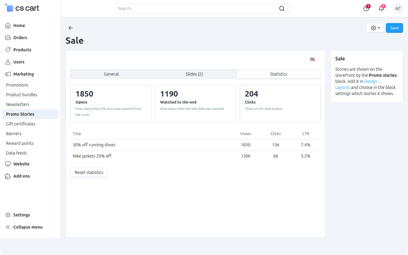
The Reset statistics button sets the counters of this story to zero — for example, before a new campaign. Deleting a story or a slide deletes its statistics too.
The counters count events, not unique visitors: if one customer opened a story three times, these are three opens. Events are collected in the browser and sent in a batch when the viewer is closed, the page is left or the tab is switched, so the figures in the admin panel may show up with a short delay.
In order to have access to add-on upgrades, you must have an active upgrade subscription. If the subscription period has expired, you will only have access to upgrades released before the expiration date of your subscription. You can renew your upgrades subscription in the "License Management" section on our website.
The add-on supports instant upgrades via the CS-Cart Upgrade Center. The built-in CS-Cart Notification Center (bell) will notify you about new versions release of the add-on. Upgrades via Upgrades Center will allow you to switch to a newer version without losing add-on data and settings.
Before start an upgrade process, it is highly recommended to make a full backup of the site (database and files) of your store using the server or hosting methods.
Upgrade through the Upgrade Center
- In the top menu, go to Administration → Upgrade Center;
- In the gear menu, click "Refresh available upgrades"
- Find and add-on on list of available upgrades and click the Download button and than Install button;
- Follow all the instructions that will be shown during the upgrade process;
- It is recommended to clear the CS-Cart templates cache after the upgrades are installed by deleting the var/cache folder on your server or adding the ctpl parameter to the address bar (example: https://domain.com/admin.php?ctpl).
Addon Reinstallation by uninstall old and install new:
Reinstalling an add-on means deleting the add-on's settings and data. Reinstallation will allow you to get a clean installation of the latest addon version. To reinstall the add-on with saving the add-on settings and data, please contact us via our Support Center to provide this service.
To completely reinstall an add-on without saving data, follow these steps:
- Go to Add-ons → Manage add-ons and find the old installed add-on.
- Click the delete button in the gear menu of the add-on.
- Download the latest version of the add-on on our website in the "License Management" section.
- Go to Add-ons → Manage add-ons and in the gear menu select Manual Installation. Select the previously downloaded file and complete the installation of the add-on.
The technical support of the add-on is already included in its price. Before contacting the support center, please make sure you are using the latest released version of the add-on. Old versions of the add-on are not supported by technical support.
To use our technical support, follow these steps:
- On our support center site https://helpdesk.cs-commerce.com/, log in with your account;
- Click on the "Create ticket" button;
- Fill in all the required fields and create ticket (you will receive a confirmation email);
- Expect a response from a specialist (a notification will be sent to your e-mail about the response) in accordance with the regulations of the technical support service.
If you have not received an answer within the time frame specified in the regulations, write us a message to the e-mail [email protected] with the subject of the ticket and we will try to resolve your issue as soon as possible.
Technical support via chat on the site, direct phone calls or e-mail letters is not provided. All help discuss goes through the support center. Carefully study the documentation for the add-on and the terms of technical support before creating a ticket. We recommend that you familiarize with the general restrictions:
- Fragments of code or some files of an add-on may have a private (encoded) part. The coded part does not create problems on add-on customizations;
- The add-on will work only on those domains that are specified in the user's license. If you try to use the solution the domains of which are not included in the license, the add-on will be automatically disabled;
- Installing on local machines is not allowed by the licensing system. For the add-on to work on an additional domain (alias), specify this alias on the license management page. Up to three aliases are allowed per domain for testing and development purposes. You can change the main license domain yourself on the license management page.
To have possibility to add or change license domains and aliases, the upgrade subscription must be active. To change the license domain of an expired upgrades subscription, you must first renew your subscription.
Version 1.0 of October 2, 2026
- The first release of the add-on: stories with promotions and news on the storefront, a full-screen viewer with gestures and a button leading to the product, managing stories and slides in the admin panel, one-click demo stories and story cloning, open and click statistics.